
What is the Rule of Thirds?
The Rule of Thirds is a helpful compositional guideline that is a great reference point for beginner photographers or seasoned professionals. As with any photography rule, they really are meant to be broken, so take this as more of a general guideline than a defined rule.
Notes From The Field: In my opinion, compositional techniques such as the Rule of Thirds are even more important in film photography. This is because you have a limited number of photos in each roll of film and there is a cost for development so you need to make each frame count. By understanding compositional techniques, you’ll find it easier to intuitively make interesting images with each frame of film.
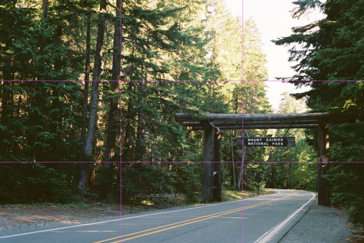
The rule is what it sounds like. It breaks your image up into vertical and horizontal thirds. Since most film cameras don’t have grid lines in the viewfinder, the best way is to try to visualize the Rule of Thirds grid lines in an image like the overlay below.

Why Does the Rule of Thirds work?
The main theory behind the rule is that if you place the main subjects in your composition along the imaginary lines or intersections which the Rule of Third creates, then your overall image will be more balanced and interesting.
So why does this work?
Interestingly enough, there are some deeper psychological reasons why this rule works. This is worth remembering as it will give you a deeper understanding of how your audience might perceive your image when looking at it for the first time. Remember, people’s attention is a limited resource and it’s constantly being bombarded throughout the day. So, in reality, you only have a few seconds to grab someone’s attention before they focus on something else.
Here are just some of the reasons how Rule of Thirds makes a more interesting image::
- Your mind is very powerful and will do everything possible to make order out of chaos. It does this by creating relationships between things to understand them.
- Odd numbers have more attention-seeking capabilities than even numbers as they take longer for our brain to process (Terrence M. Hines “An odd effect: Lengthened reaction times for judgments about odd digits”).
- Most people in western societies scan from left to right. So, if you place your main subject on the right third, you’ll naturally lead their eye to the subject which can create a more interesting image.
Notes From The Field: Again, all composition rules are meant to be broken. The main strength of the Rule of Thirds is that it’s a guideline that helps you notice the compositional benefits of off-center framing. This is because many beginner photographers and even experienced photographers have a natural tendency to frame the subject of the composition in the center of the image.
How to Use the Rule of Thirds

As with learning anything new, learning how to use the Rule of Thirds will take some time. However, once you gain enough experience using the rule, you’ll be able to intuitively sense the Rule of Thirds without having to think about it.
Here are some things you should think about when you first start to implement the Rule of Thirds in your photography.
- What aspect(s) in the scene are you trying to bring attention to? Once you figure out what the main subject is in your composition, try placing them on the different intersections or different lines to see what makes a better composition.
- Will your composition emphasize what’s below or above the horizon line? For example, if you want to emphasize the sky, try placing the horizon line on the bottom horizontal third line.
- What is the image going to be about and what should be excluded from the image? Sometimes what’s excluded is more powerful than what’s included in the composition.
Notes From The Field: When using the Rule of Thirds it’s important to remember that your main subject doesn’t have to be exactly on the grid lines or the intersecting lines to work. Each composition you create will be different so you’ll have to adjust the rule for each image you’re making.
When Not to Use the Rule of Thirds
Even though the Rule of Thirds is a great compositional guideline to reference, there are still some situations where you shouldn’t use this rule such as:
- When you want to emphasize the symmetry in an image.
- When it makes sense to frame your subject in the center of your image.
- If you’re shooting with a shallow depth of field to separate your subject from the background.
- If it just doesn’t make sense to use the Rule of Thirds in the location you’re in.
6 In-Depth Examples of Using the Rule of Thirds

Instead of just talking about the Rule of Thirds, let me show you how I used this compositional technique in my film photography on my recent trip in Washington State. All the 35mm photos were taken on a Nikon F3 and the medium format photos were taken on the Yashica-A. I’ve also included a description under each photo which includes what film stock I used for the photo.
As you look at these examples, notice how the Rule of Thirds is not an exact science when you use it in real-life situations. It’s a guideline, so if your main points of interest in the composition don’t exactly line up with the grid lines, that’s ok.
Notes From The Field: Just in case you’re wondering, I got all the photos in this article developed by the good folks at PhotoVision who are based in Salem, Oregon! They’re definitely one of my favorite film development shops to work with and I can’t wait to send my next rolls of film to them. These photos were all normal sized scans, but they even have a large scan option which gives you more resolution to work with if you need it.
Example 1: Sunset at Rattlesnake Lake

This photo was taken at sunset at Rattlesnake Lake in Washington State.
In this photo, the primary subject in this composition is Melissa standing on the tree stump. Because the Yashica-A makes a 6×6 image, I thought a center framed composition worked best for this composition. To draw more attention to Melissa, I placed her on the bottom center horizontal line. At the same time, since the horizon line was placed near the bottom horizontal line, it also puts more emphasis on the sky, which was just starting to change to an orangish hue from the setting sun.
My goal in composing this image is to have the viewer’s eye travel from bottom to up and stop on Melissa first, who is the primary point of interest. Then, for the eyes to continue to travel upward towards the sky so they can take in the magical glow from the setting sun. I think this gives the composition a nice balance and uses blank space effectively.
Example 2: Mount Rainier Sunrise Reflection

This photo was taken during sunrise in Mount Rainier National Park just as the sun lit up Mount Rainier in its orange glow.
Because of where I was standing with Mount Rainier and the trees I also chose to center frame this image. To place equal emphasis on Rainier and the orange glow in the lake, I chose to place the horizon line as close to the bottom third horizontal line as possible. Additionally, to further draw attention to the snow capped peak of Mount Rainier I placed the very tip of the mountain on the top third horizontal line.
My goal in composing the image with the center composition is to draw the viewer’s eye straight to the sunrise hitting the top of Mount Rainier as soon as they look at the image. I think what helps to accomplish this goal is the placement of both the horizon line and the natural frame created by the trees.
Example 3: Moonrise Over Mount Rainier

This photo was taken right after the sun had set in Mount Rainier National Park near the Sunrise Visitor Center.
In this composition, there are three main points of interest; the moon (1), the leftmost mountain peak (2), and the rightmost mountain peak (3). The most important lesson I wanted to show you from this image is that you don’t necessarily need to have your points of interest directly on one of the Rule of Thirds grid lines for the image to work.
Because I was using a 50mm lens and didn’t have the option to move further away from the scene, this was the best I could do. I think this image still works, though, because each of the points of interest is still within one of the Rule of Third quadrants.
My goal in composing this image was to use the natural tendency of the viewer to scan the image from left to right. So, when the viewer looks at the image, their attention will drift towards the moon first, then go to the leftmost mountain peak, before ending at the rightmost mountain peak. Although each point of interest is not directly on the Rule of Thirds grid line, I think the spacing between each interest point allows for a nice balance in the image.
Example 4: Top of Rattlesnake Lake

This photo was taken at the top of Rattlesnake Ledge during the afternoon. The lake below is actually the same lake from the first image.
In this image, Melissa is the main point of interest and the view of Rattlesnake Lake is the second point of interest. To further emphasize Melissa, I placed her as close to the lower right intersection point as I could. Then to make sure the viewer’s attention would find its way to the blue waters of the lake, I also had Melissa stand facing the lake as humans are subconsciously curious about what other people are looking at.
My goal in this composition is to have the viewer’s eyes naturally scan from left to right and first stop on Melissa who is in the lower right intersection of the image. Then for the viewer to follow Melissa’s gaze to the left of the image where they will find the expansive lake and landscape scene open up below her.
Example 5: Light Rays Over Rainier

This image was taken in the late afternoon as the sun was making its way down towards the horizon. At this time of day with these weather conditions, you’ll often see rays of light streaming down into this valley.
In my mind, there were 4 different points of interest in this image, the running river near the bottom left intersection (1), the blue lake on the bottom left grid line (2), the light rays near the right grid line (3), and the clouds that are on the top grid line. When I was capturing this image, I thought it was very easy for the light rays to overpower the image. So, to place more importance on the other points of interest in the image, I tried my best to keep the light rays only in the right third of the image.
My goal in composing this image was to have the viewer’s eyes first notice the river and the lake in the bottom left. Then for their attention to naturally scan left to right to the light rays before finally moving the clouds in the sky.
Example 6: Sunrise Visitor Center

This photo was taken right after we started our hike from Sunrise Visitor Center and was one of the simpler compositions we have covered in this article.
In the image, the main point of interest is of course Sunrise Visitor Center. However, there is also a secondary point of interest which is the mountain range in the background and the clouds above.
To draw attention to these two points of interest I first placed Sunrise Visitor Center on the bottom right third intersection point. I then tried my best to align the horizon line (where the mountains meet the trees) with the bottom horizontal grid line.
Since the sky was just starting to turn a nice soft blue, I think the overall placement of Sunrise Visitor Center and the horizon line, allowed me to highlight the color of the sky as well.
My goal in composing this image is to have the viewer’s eyes first travel from left to right and land on Sunrise Visitor Center. Then for their attention to drift upward to the mountain range behind the visitor center before continuing upwards to the clouds and the sky.